Responsive Web Design
Adapting to the Digital Landscape
Responsive Web Design
is a fundamental approach to website development that has transformed the way we interact with the internet. It’s a design philosophy that prioritizes the creation of websites and web applications that can seamlessly adapt to various screen sizes and devices. In a world where digital experiences are accessed through a multitude of devices, responsive web design ensures that the content remains accessible and user-friendly on any screen, whether it’s a desktop computer, tablet, or smartphone.
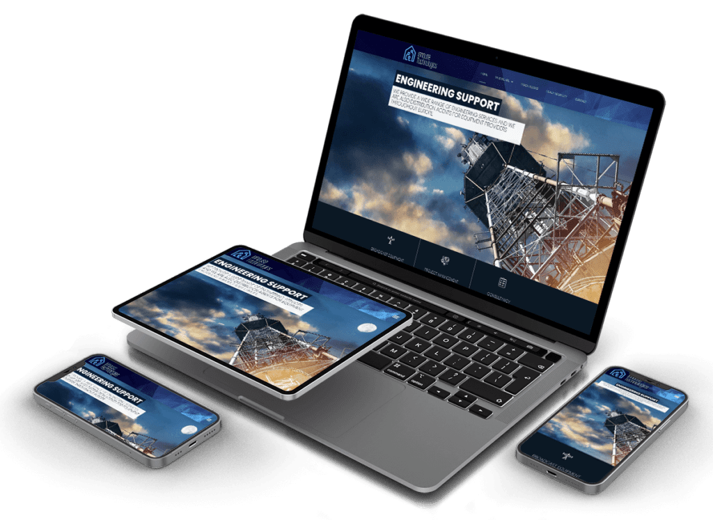
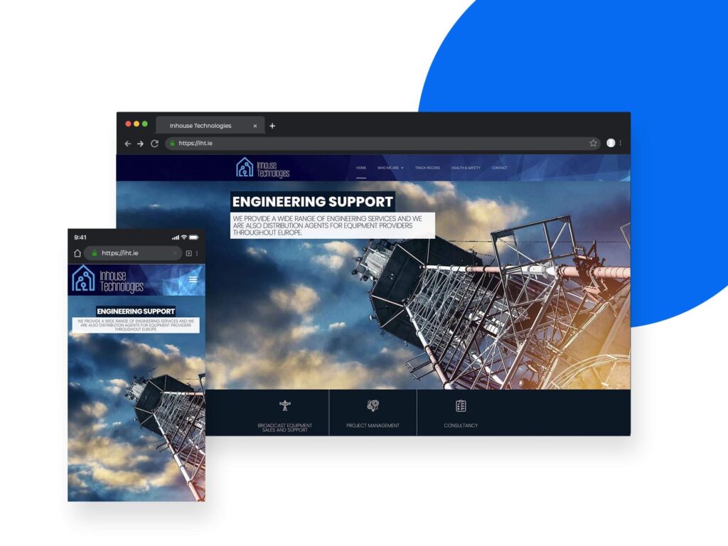
Responsive websites use fluid grid layouts, which means that the elements on a web page are sized in relative units like percentages rather than fixed units like pixels. This allows content to expand or contract to fit the screen size, maintaining readability and usability
Images within responsive design are also resized proportionally. This prevents images from breaking the layout or overflowing the screen
Media queries are CSS techniques used to apply different styles and layouts based on the characteristics of the device or screen. For example, a media query can adjust the font size and layout for smaller screens
In responsive design, it's crucial to prioritize content based on its importance. For smaller screens, less important elements can be hidden or displayed differently, ensuring the most critical information is readily available
Benefits of Responsive Web Design
Enhanced User Experience: Responsive design provides a consistent and user-friendly experience across various devices. Users don’t need to pinch, zoom, or scroll excessively to access content.
Improved SEO: Search engines like Google favor responsive websites. Having a single, responsive site makes it easier for search engines to crawl and index your content, potentially improving your search engine rankings.
Cost-Efficiency: Maintaining a single responsive website is more cost-effective than managing multiple versions for different devices.
Increased Mobile Traffic: With the growing use of mobile devices, a responsive design ensures your website is accessible to a wider audience, potentially increasing traffic and engagement.
Future-Proofing: As new devices and screen sizes emerge, a responsive design is adaptable, future-proofing your web presence.


In today’s digital landscape, responsive web design is not just a feature; it’s a necessity. As more and more people access the internet via smartphones and tablets, providing a seamless and accessible user experience is vital for the success of websites and web applications. Embracing responsive design is not only a best practice but also a strategic move to meet the evolving needs of your audience and the dynamic digital environment.